The Waterman Pharmacy branding project is centered around creating a logo that reflects the essence of healthcare and community support.
The primary logo, with its clean sans-serif font and modern design, emphasises trust, professionalism, and accessibility. The logo’s vibrant color palette and balanced structure were thoughtfully designed to represent Waterman Pharmacy’s commitment to quality healthcare and its patient-first approach.
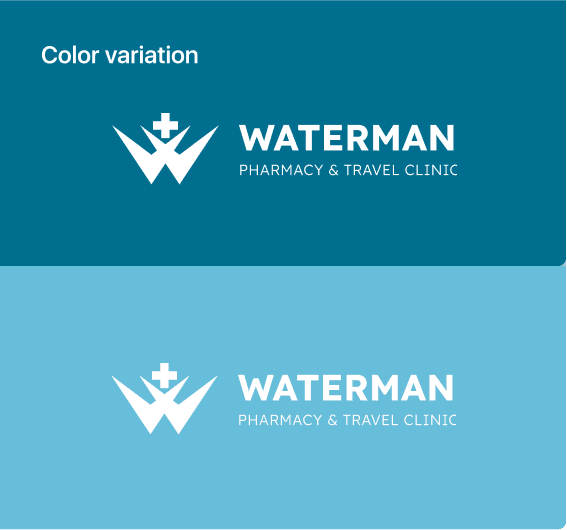
The blend of blue and green hues symbolises trust, wellness, and vitality, perfectly mirroring the brand’s vision of delivering healthcare solutions with a human touch. The sleek typography and minimalistic design ensure that the logo communicates clarity and confidence across all platforms.