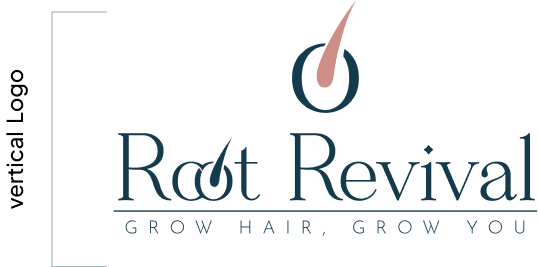
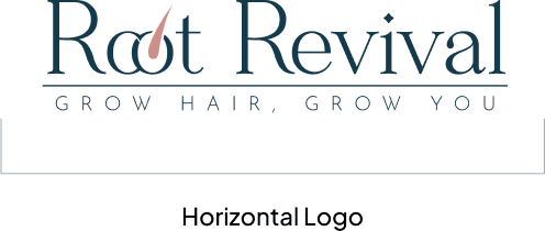
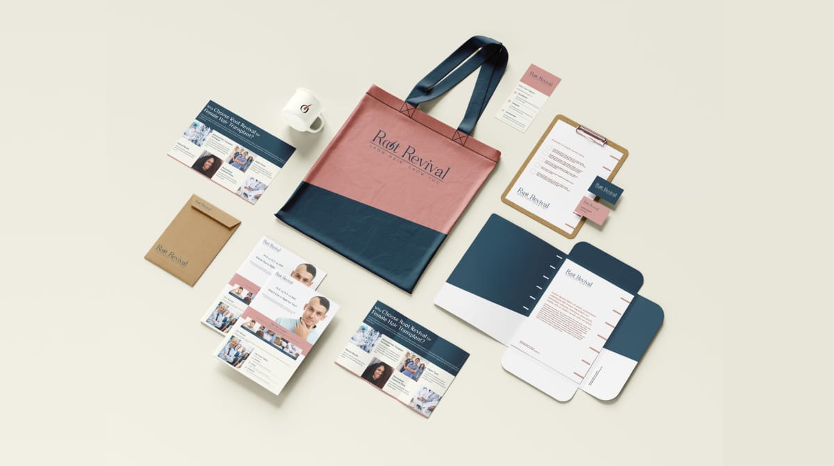
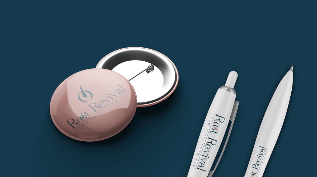
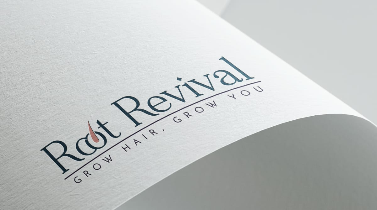
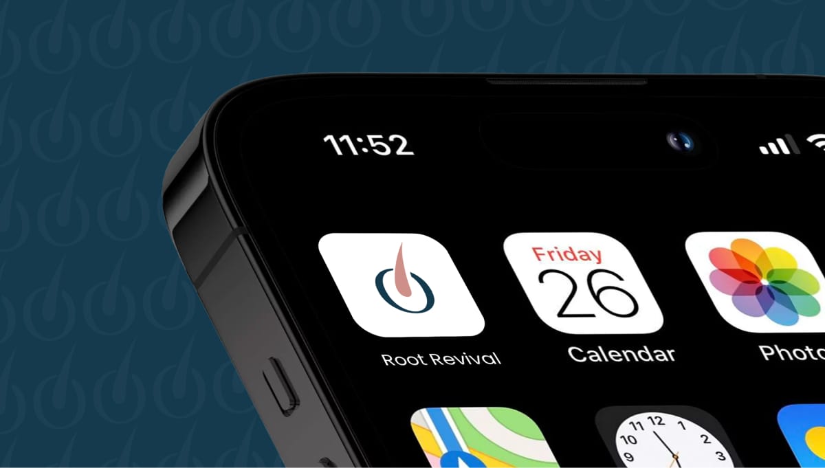
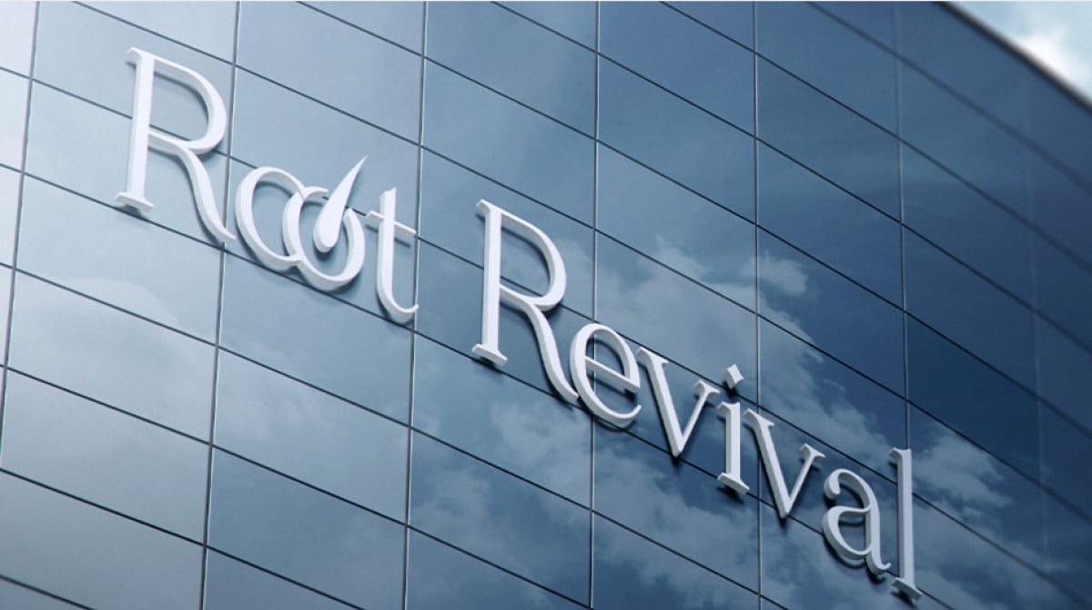
The Root Revival branding project was all about creating a logo that serves as the visual cornerstone of the brand’s identity. The main logo, with its elegant serif font and refined design, was carefully crafted to reflect sophistication and professionalism. Complementing this, the secondary logo and submark ensured versatility across digital platforms, social media, and print mediums.
The choice of colors - a soothing blend of navy blue and coral - symbolises trust, rejuvenation, and vitality, perfectly aligning with the brand’s ethos.
Each variation of the logo, from the circular curves to the intricate detailing of the “O,” metaphorically illustrates the stages of hair restoration, reinforcing the brand’s narrative at every touchpoint.