From startups to large enterprises, Unified Web Services, a London and Essex-based social media and web design agency, delivers bespoke digital marketing and web development solutions.
WEB

Development
Digital Marketing
Graphic Design
Packages
How often do you browse on mobile devices rather than desktops?
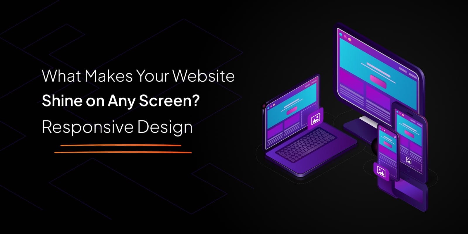
In today's digital world, where mobile devices dominate browsing habits, having a website that adapts seamlessly to any screen size is crucial for UK businesses to engage customers and drive conversions.
But what is the need for responsive designs, especially for businesses targeting UK audiences?
Internet browsing on smartphones among the UK population is reaching its peak. According to general statistics, 93% of the country’s total population use their smartphones to access the internet. That's a massive chunk of potential customers who could be visiting your website! But if your site isn't optimized for mobile, you risk losing their interest - and potentially a sale.
To list a few options offered by mobile devices for your businesses;
There is something that you would like to understand even before knowing the need for a responsive design.
What exactly is a responsive design?
It’s the magical flavor added to your website that makes it look fantastic and helps function flawlessly on any device, from the tiniest smartphone screen to a wide-screen monitor. But it's not just about looks – it's about creating a seamless user experience that keeps visitors coming back for more.
Are you getting a good number of return visitors to your website? Let us know your answer in the comments.
There’s nothing wrong with analyzing your website's performance across various devices - desktops, laptops, smartphones, tablets, etc. Check if you can find any pain points or areas for improvement in your website.
But above all this, what could be the best ingredient that you can get to prepare a tasty stew for your customers?
It is none other than the user feedback. Gather user feedback on the mobile experience. This provides valuable insight into what needs to be done further to improve your website performance on mobile devices.
Luckily, according to the 2024 trend, you will find plenty of tools and techniques in the market to help make your website responsive. From fluid grids and flexible layouts to responsive images and media, there's no shortage of options to explore. Find yourself the best tool suitable. And with the right approach, you can create a website that not only looks great but also drives results for your business.
When it comes to developing a responsive website, it's all about choosing the right approach for your business. So be clear about your audience's interest and design a website that is not just informative but also user-friendly. Whether you opt for a mobile-first design or progressive enhancement, the goal is the same: to create a user-friendly experience that keeps visitors engaged and coming back for more.
Most of us forget the important phases after launching our responsive websites. And those phases are the testing and optimization phases. Once your responsive website is up and running, the work doesn't stop there - it's important to regularly test your site across different browsers and devices to ensure everything is working as per your expectations. Analyzing user behavior and adjusting accordingly can help keep your website ahead in the market.
Need some inspiration?
Grab your inspiration from the existing UK businesses thriving online for visibility and growth. By implementing responsive design, they've improved their online visibility and driven measurable results and business growth. It's proof that responsive design isn't just a trend - it's a necessity for success in today's digital world.
Responsive design has a great impact on SEO. No wonder, SEO-ranked responsive designs can improve your organic traffic. With Google prioritizing mobile-friendly websites in its search rankings, having a responsive website is key to boosting your online visibility and driving organic traffic to your site.
What does the future hold for responsive design? As technology continues to evolve, how we interact with websites will also increase. By staying ahead in the market and embracing emerging trends and technologies, you can ensure your website remains relevant and effective in the ever-changing digital market.
Here’s your first step!
Ready to take your website to the next level with responsive design?
Contact us today to learn how our innovative solutions can transform your online presence and drive business growth. Don't let your website be left in the digital dust - let's make it shine on any screen!

For budget-friendly custom websites in Essex that elevate your business and drive results, choose Unified Web Services. Let's chat about your next project. Your success is our priority.

From startups to large enterprises, Unified Web Services, a London and Essex-based social media and web design agency, delivers bespoke digital marketing and web development solutions.